


Understanding what chart patterns are and how to use them to optimize your trading is a bold move in your investing career. Whether you’re a beginner or an experienced trader, prefer fundamental or technical analysis, a trend reversal or a continuation pattern, Forex, Futures or Cryptocurrencies, price patterns are crucial.
That’s why we are here to talk about chart patterns and how you can identify the most popular chart formation and patterns. But before running, we should learn how to walk. Let’s see what these charts are.
What is a price chart?
Charts are simply visual representations of price movements most commonly measured by the opening price, the high, the low and the closing price. Charting found its origins in the commodity markets after the introduction of futures markets which evolved between the 17th – 19th centuries.
The first agricultural futures exchange documented was in Japan (rice futures) in the 18th century and subsequently the CBOT in Chicago in 1848 and the LME in London in 1877.

The Japanese traders developed candlestick charts, whereas western markets initially preferred Point and Figure charts that could condense a lot of price movements in a portable piece of paper, and later on bar charts to represent price movements with the advent of Dow Theory.
Nowadays, due to the evolution of technology, virtually every trader has some graphic representation or chart on their desktop, laptop, smartphone or tablet. However, until the 1930s chart representation in the media was non-existent and access to technical charts as late as the early 1980s was generally via weekly print subscriptions.
When viewing charts certain patterns repeat themselves and astute analysts like Charles Dow and William P. Hamilton applied their skills to developing trading strategies based on their observations. Chart patterns are not as popular as they used to be but can be insightful.
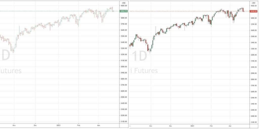
Candlestick charts are even more popular than bar charts as they are simpler to read, stripping out the extraneous price movement data that bar charts include. Besides, they translate the day’s price range into an up day, a down day, or a so-called “Doji” pattern (no change). The same information is included in a bar chart but the open and close are indicated by simple ticks, on the left for the open, and on the right for the close but provide a solid bar of the day’s movement, leaving it up to the observer to determine the price action. (Chart 1).
Chart 1 Bar vs Candlestick Chart
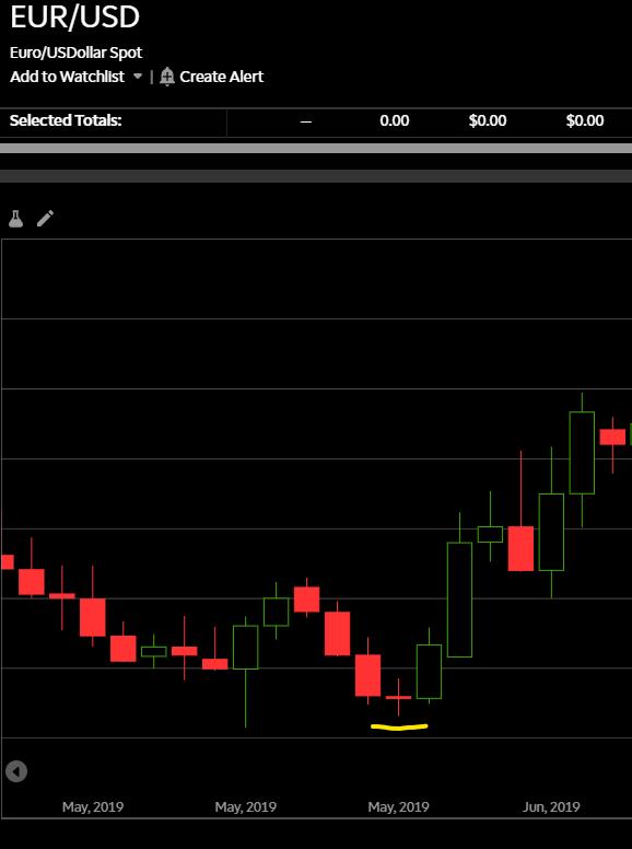
The Doji chart pattern
A Doji is a commonly occurring candlestick that denotes that whilst there has been price action above and below the opening price, the close is either exactly-the-same level the instrument being traded opened at or is extremely close to it.
The most common Dojis look like a cross (+) and aren’t considered as a reversal signal. However, the fact there have been price oscillations above and below the opening price, supply and demand cancelled one another out. A Doji is therefore considered a sign of uncertainty or change.
Whenever I see a Doji on a chart I’m monitoring it forces me to re-evaluate the reason I put the trade on. If I am looking to put a position on but looking for a better entry price, it makes me reconsider market conditions and timing.
A Doji candlestick means that the trend has slowed down – but it does not imply an immediate reversal. This is a frequent misinterpretation leading to a wrong use of Dojis. Despite the odds of a market turn increasing with a Doji, it still lacks a confirmation to be traded upon.
In that sense, if the price on the next candlestick moves materially higher or lower on the close, it either refutes or confirms the direction of the prevailing trend (Chart 2).
Chart 2 Doji
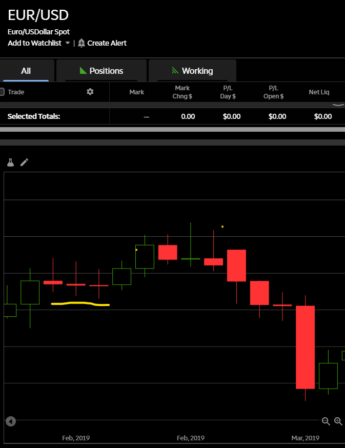
A series of consecutive Dojis on daily charts (or longer time periods) imply the market is having serious reservations over trend direction and if they occur after a particularly strong trend, are a red flag for trend followers. The Japanese say the market is “exhausted”.
It’s a signal to check other technical indicators that measure trend intensity, relative strength or momentum to evaluate liquidating the position.
Chart 2A Multiple Dojis
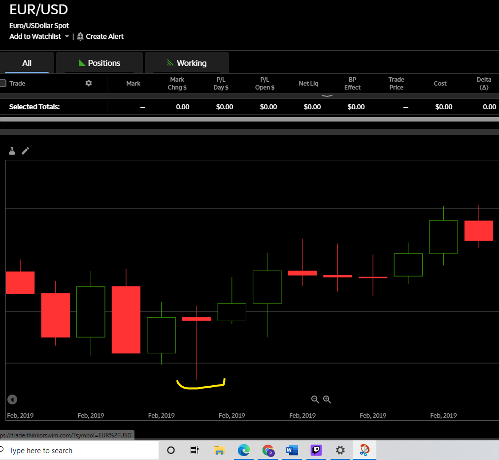
All Dojis are not created equal however, some are more powerful indicators than others. There are two particularly strong Dojis, the Dragonfly Doji and the Gravestone Doji.
Technical analysis and the Dragonfly Doji
A Dragonfly Doji is a strong signal that prices will move higher, its characteristics are similar to a normal Doji, I.E. the opening and closing price are virtually the same level (or in very close proximity). In this instance, the market drove prices significantly lower after the open but buyers emerged on the way down and strong demand drove prices back to the opening levels.
This is a sign that the market is looking to buy dips and you can anticipate further demand in the next few sessions. It is thus seen as a bullish signal rather than neutral. (Chart 3).
Chart 3 Dragonfly Doji
Gravestone Doji
A Gravestone Doji is a strong signal that prices will move lower, its anatomy is similar to a normal Doji, I.E. the opening and closing price are virtually the same level (or in very close proximity). In this instance though, the market drove prices significantly higher after the open, but sellers emerged on the way up and strong supply drove prices back down to the opening levels.
This is a sign that the market is looking to sell rallies and you can anticipate further supply in the next few sessions. The Japanese analogy is that it represents those who have died in battle. (Chart 4).
Chart 4 Gravestone Doji
Other important Candlestick Patterns
There are many important candlestick formations that are worth researching, however, we’ll just describe a few more before we extend our perspective to include other sorts of charts and other important chart formations.
Evening Star
An Evening Star formation develops at the end of a strong uptrend. It denotes significant buying pressure that culminates in a topside gap on the daily chart that initially continues higher on the day but the move fizzles out. Sellers emerged on the rally as the market is long the underlying instrument.
Confirmation can only be determined at the close of the following day: if the following day’s candle registers a heavy sell-off, evidenced by either a long bearish candle that closes much lower or a more bearish engulfing candle implying that buyers took prices higher than the previous day’s evening star high but prices closed significantly lower.
This formation is a strong signal to exit longs and if so inclined, enter short – to be used as a sell signal or a “stop and reverse” signal (Chart 5).
Chart 5 Evening Star
Abandoned Orphan
An Abandoned Orphan formation develops toward the end of a strong down- or upward trend when selling or buying pressure subsides, culminating in a failure to penetrate the most recent significant low or high. This exhaustion of the trend is followed by a gap, a so-called “window” in Japanese candlestick parlance.
This is a strong reversal signal, denoting the market was predominantly short or long the underlying instrument, but it now risks being reversed. Once again, it can be used as a strong exit signal and if so inclined, go short or long the new trend with a type of “stop and reverse” signal (Chart 6).
Chart 6 Abandoned Orphan
Other Important Chart Formations
Let’s check other popular price patterns and how traders can take advantage of these chart formations.
Read more about technical analysis: What Is Technical Analysis and How To Use It
Double tops and bottoms
Double tops/bottoms are an important sign of resistance/support to the underlying trend. Optimally, the price stops at exactly the same level of a previous swing high or low, or in close proximity to that prior top/bottom.
There is a tendency, particularly in the forex market, to test stop-loss orders clustered above previous highs or below previous lows before finally reversing the trend (Chart 7 and 8).
Chart 7 Double Top
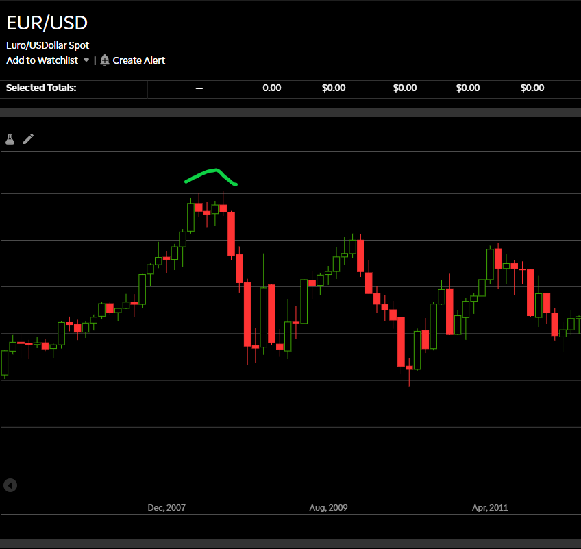
Chart 8 Double Bottom
Triple tops and bottoms
Triple tops/bottoms are very rare and are an important sign of resistance/support to the underlying trend. Similarly to the double top/bottom pattern, the price is unable to cross a certain price level upon three attempts and stops at exactly the same level or in close proximity to the prior two tops/bottoms.
As with any reversal pattern, the invalidation of a triple top or bottom can be seen as a continuation signal. (Chart 8 and 9).
Chart 8 Triple Top
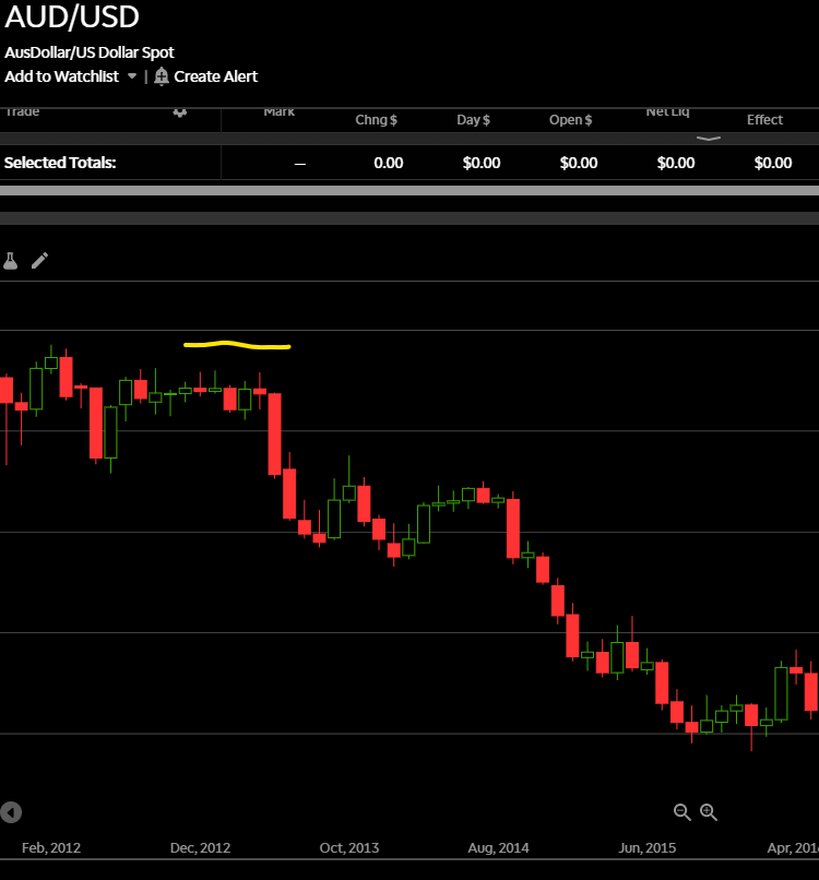
Chart 9 Triple Bottom
Point and Figure Charts
The above price formations are even more evident on point and figure charts which simply register price movement irrespective of how much time has transpired, point and figure charts were extremely popular back in the 1970s and 80s prior to traders’ accessibility to reliable computing sources.
In 3-box Point and Figure charts, double-top and bottom patterns can be either a continuation or reversal. Moreover, a continuation pattern is more reliable because it occurs in the direction of the trend. (Chart 10).
Chart 10 Triple Top and Bottom on Point & Figure Chart

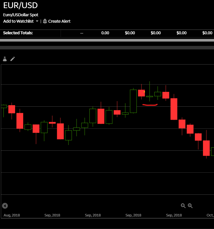
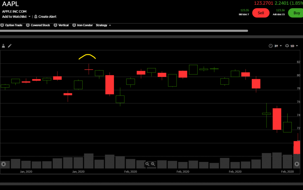
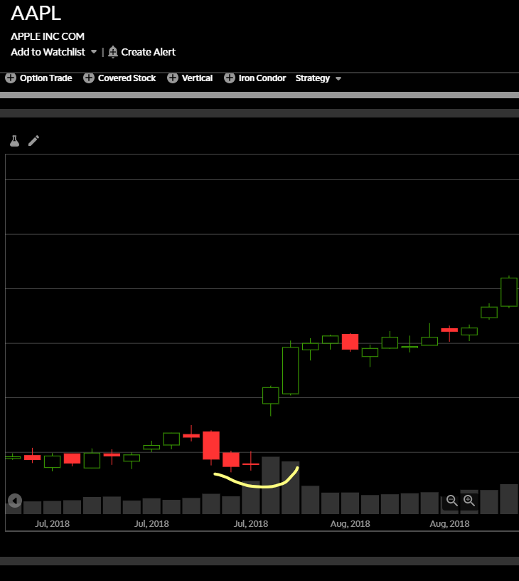
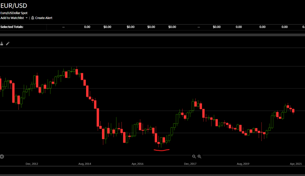
Rounded tops and bottoms
Also called “Saucer”, “Bowl”, or “Coup”, these chart figures are more difficult to discern and it’s difficult to obtain breakout points for these patterns. They result from an extended period of price movement that pushes prices up (or down) to significant highs (or lows) but fails to penetrate that price apex (or nadir).
After extended attempts to break the highs (or lows) traders become increasingly more convinced that the underlying trend has peaked (or bottomed) and start to put on short (or long) positions in direction of the developing trend.
These reversal patterns can also appear in very long price consolidations, as a gradual changeover in the demand/supply balance. (Charts 11 and 12).
Chart 11 Rounded Top
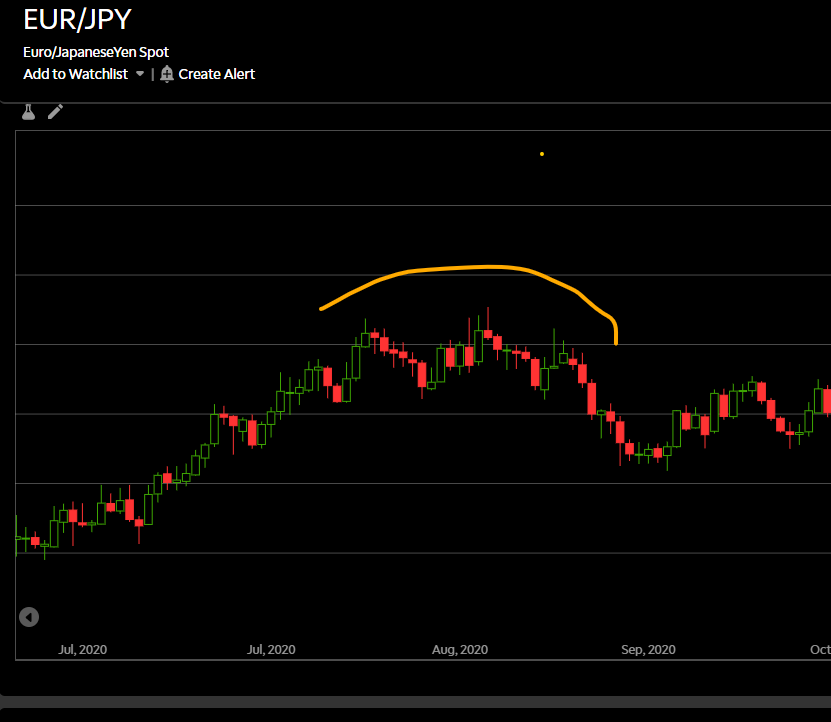
Chart 12 Rounded Bottom
References and bibliography used in this article
- Chartered Market Technician Program by CMT
- Technically Speaking Journal by the CMT
- Here are 7 of the top chart patterns used by technical analysts to buy stocks by Business Insider
- An Introduction to Technical Analysis by Harvard Business Review
For more insights into market indicators, chart patterns, and much more, browse our range of trading strategy articles or check out our guide to becoming an online trading pro.

