
Understanding different chart types and recognizing important price patterns will help you optimize your trading, whether you are a beginner or an experienced trader. Alongside fundamental and or technical analysis, the ability to recognize a trend reversal or a continuation pattern should enhance your trading skills,
Whether you trade forex, futures, fixed income, equities, or cryptocurrencies, price patterns are an essential insight into market behavior and sentiment. At the top of that, understanding how to read candlestick charts could be the key to increase your profit ratio consistently.
A brief story of the candlestick chart
Candlestick charts pre-date bar charts were developed by Munehisa Homma to interpret different price movements on Sakata’s rice market, a vital rice trading port in the 18th century. Originally like most agricultural products, rice was traded on a cash basis on what is now considered to be the modern world’s first commodity futures exchange called the Dojima Rice Exchange located in Osaka.

According to various sources, Munehisa Homma transferred much of his trading activities to the Dojima Exchange. The Dojima Exchange started trading “rice coupons” around 1710. The coupons were promises of delivery for the following year’s rice harvests and several cycles in the future. Nowadays, they would be considered futures contracts.
Munehisa Homma started trading in the 1750s and began making records of rice futures prices and was highly profitable, creating the modern-day equivalent of billions of USD. He also studied the history of rice market prices and the impact of market psychology and wrote books on how to trade these markets.
The fact these charting methods have been around for over three and a half centuries has enhanced their credibility in the west since their introduction in 1991. Steve Nison wrote the book “Japanese Candlestick Charting Techniques” after being fascinated by the concept while visiting Japan, and since then, the candlestick chart has become the dominant methodology.
What are Candlestick Charts?
Candlestick charts are an alternative way to represent price action for a specific period. They are constructed by drawing a vertical line representing the range of the period you’re charting. If the opening and closing prices are different, a rectangle is drawn to illustrate the difference between where the underlying instrument opened and closed. The result is an image that looks like a candle with a wick at both ends (most of the time).
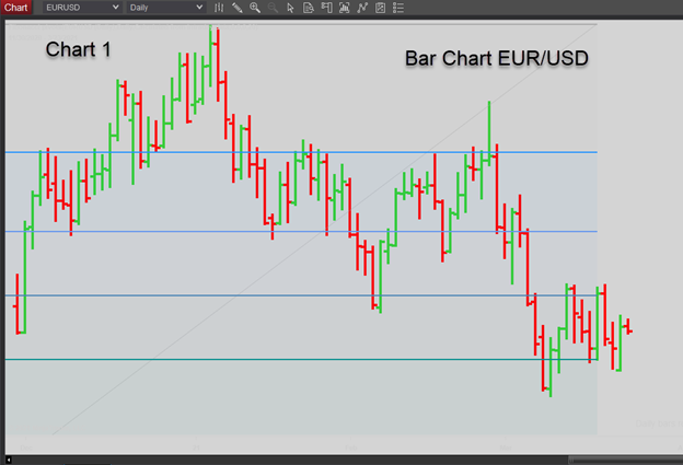
So, why are candlestick charts so popular? As opposed to bar charts, candlestick charts highlight the relevant underlying price action rather than just the Open, Hi, Low, Close format. While Bar charts have been improved on most trading platforms, utilizing contrasting colors for up days and down days instead of the old-style solid black design, they still don’t focus on the most crucial factor, the net price movement on the period.
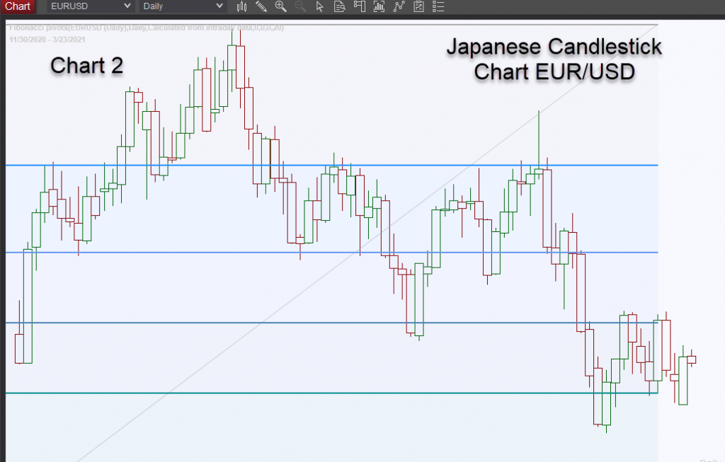
Compare Chart 1 to Chart 2, and you’ll note that the price trends are more easily identified. More importantly, the market’s pauses when there has been little or no net price change daily are also much easier to remember.
They are represented most of the time by an image that looks like a cross (+), and we’ll cover those later in another educational segment. The object of this trading lesson is to familiarize the reader with the appearance of a candlestick chart and how to incorporate them into their daily trading techniques.
Working with Candlestick Charts, how to analyze them and how they can help improve your trading results
Candlestick traders are mainly focused on long wicks. They represent price action extended by strong supply or demand intraday but retraced much of the price action as sellers or buyers emerged when prices were stretched. This indicates the market’s sense of value for the underlying instrument when prices retrace dramatically.
In charts 3, 4, and 5 below, which depict recent EUR/USD price action, the long wicks presage sharp movements for the following days. Chart 3 displays a heavy sell-off following a bearish candle the day before, and prices plunged; however, buyers emerged around a cluster of previous lows.
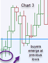
Chart 4 reveals choppy market price action, with long wicks on three consecutive days. A bearish candle foretold that prices would decline, and EUR/USD fell sharply the following day.
However, the market remained bullish and bought that sharp sell-off, reversing the previous day’s action intimating higher prices would be seen the next day.
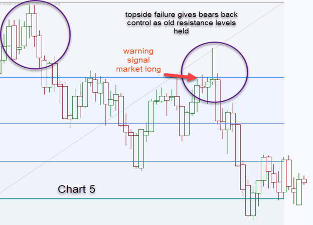
EUR/USD surged higher but couldn’t clear resistance at the cluster of highs around the most recent significant top (Chart 5), resulting in a very bearish candle with an extremely long wick (Gravestone Doji), and prices subsequently collapsed. We’ll discuss specific candlestick patterns in a separate educational piece.

Long wicks on a Candlestick Chart reveal a lot about market sentiment and/or market positioning. If there are conflicting long wick bull and bear candlesticks nearby, it’s indicative the market is about to pop in a big way.
If you see those chart formations, you need to check your other technical indicators, such as momentum studies, Directional Movement Index (DMI), Bollinger Bands, Keltner Channels, MACD, etc., and determine which direction is the most likely.
The drawback in using daily charts, mainly when trading long wicks, is that the following day’s close can only reinforce the confirmation.
In Chart 5, that would have been a considerable price concession. However, knowing that the red candlestick on Feb 23 revealed the market was uncertain of trend direction, the bullish close on Feb 24 should have been monitored very closely as these are conflicting indicators. Both bulls and bears were getting chopped up by the volatility.
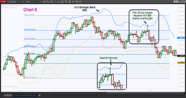
The bullish close on Feb 24 required closer inspection and needed to be gauged by reliable overbought indicators such as the relative strength index (RSI), the directional movement index (DMI), or my personal go-to indicator, Bollinger Bands.
For volatile instruments, I use a top band of +3.0 to +3.5 vs. the recommended overbought level of +2.0. In this instance, on Feb 25, EUR/USD hit between +3.0 to +3.5, heavily overbought – a condition that can’t last for long.
By overlaying that study over the chart before the next trading day, you would have known in advance that levels were way too stretched and should have squared longs and considered a stop and reverse order (SAR) at the top Bollinger Band (see Chart 6). On Feb 24, the Bollinger Band reading for Feb 25 at +3.0 was 1.2231, +3.5 was 1.2249, a decent exit range for logs.
Another way to determine whether the bullish close on Feb 24 would hold was to drill down to shorter periods to analyze the next day’s price action.
Combining candlestick charts with RSI and Bollinger Bands on the EUR/USD 30-minute charts, we derived 3 sell signals before the close; Bollinger Bands near +4.0 after RSI peaked (negative divergence); A break of the pre-peak intraday significant low; And a break below the previous day’s highs (which became support). The three price levels were 1.2241, 1.2222, and 1.2174 vs. the 1.2168 closing price.
Combining a candlestick chart with other technical indicators

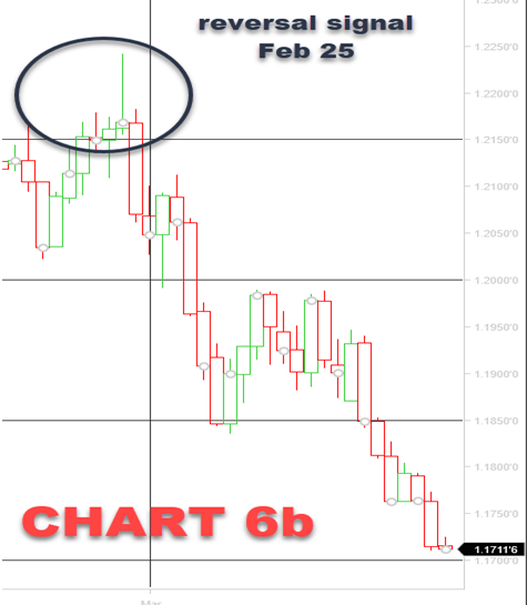
When you review trade action over subsequent EUR/USD trading sessions, you see prices declined to 1.1709 lows by March 31, corroborating the Stop And Reverse (SAR ) signal Feb 25 (Chart 6b). You can see it was a potent indicator and would have been highly profitable if you’d followed it. This demonstrates how combining Candlestick Charts with technical analysis can significantly improve your trading profitability.
Read a candlestick chart and change the way you trade
Any charting discipline helps a trader improve his or her trading results as they help you visualize the price action that you’ve been witnessing while monitoring the markets daily.
Before the late 20th-century computing power and charting capability, traders monitored price action by drawing their charts or adding their price shifts to pre-printed chart packs that they received on a weekly subscription basis. There were no screens that provided real dealing prices. The screens were simply providing non-executable price indications. The only prices you could deal on were direct quotes from other banks or counterparties or voice brokers who would shout live executable prices down a loudspeaker box on the traders’ desks.
Back then, traders would build up support and resistance levels in their minds, provided by the voice brokers’ quotes. When the brokers didn’t have executable quotes, traders would have no idea where prices were being quoted without contacting other price makers and requesting a quote.
Price discovery was the primary objective, and when the voice boxes went silent, it was a signal that the market had changed. Usually, there was a significant price change following the silence, and manual charts were updated.
There were no intraday charts, just a simple daily bar, candle, or a change on the point and figure chart. Today’s modern computing capabilities catch every single price tick, and the candlestick charts are the perfect sample of that.
To hone your trading skills, you need to translate those electronic blips on the computer screen into a price action chart in your mind. Overlay that with some robust, dependable technical analysis tools, and your trading results are sure to improve.