

Now that we have shown you how to read Candlestick Charts and how to incorporate them into your trading regimen, we’ll take a look at some of the more commonly appearing chart formations and popular candlestick patterns.
It does not matter whether you’re trading currencies, futures, fixed income, equities, or cryptocurrencies, Japanese candlestick patterns provide insight into market behavior and sentiment.
Hammer patterns
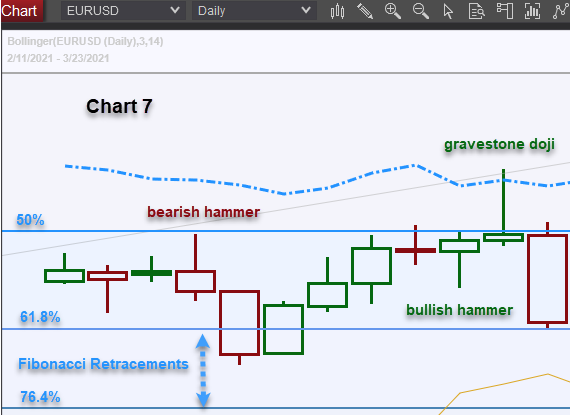
Bullish hammer patterns form when price action drives prices significantly lower than the opening price, but buyers emerge and drive prices back up to close higher than the open.
Bearish hammer patterns form when price action drives prices significantly higher, but the move fizzles out as sellers emerge. Prices closed below the opening price – some traders call this an inverted hammer.

Hammers, both bearish and bullish, are vital signs as they reveal strong supply or demand within the market and intimate how the market is positioned in the near term. (Chart 7).
Unfortunately, hammers are not a reliable longer-term tool unless they occur near the top of a trend after a series of successive highs or near the end of a trend after a series of consecutive lows.
In chart 8, you can see that the bullish hammer after the previous day’s topside rejection was correct in predicting that prices would precede higher before they could drop. This was a
reflection of the prevailing bullish uptrend evidenced by the rising green outlined candles.
That bullish hammer was a false signal, with a red flag from the previous day’s negative close. However, the following day’s bearish hammer was a trend-changing signal; prices preceded as expected higher but were rejected by strong supply.
When hammer candlesticks arrive mid-cycle or mid-trend, their intimate prices need to follow the hammer’s direction over the next one to two trading sessions but may be simply a price correction. The price correction takes some excesses out of market conditions, but the underlying trend prevails.
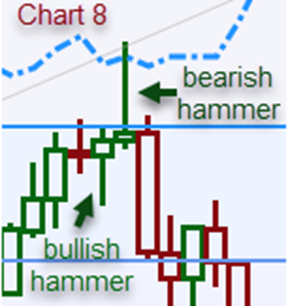
In chart 8, the bearish hammer foretold the next day’s hard sell-off. Still, buyers emerged in the session that followed that; the influence of powerful Fibonacci retracement levels attracted fresh buyers (see Chart 7), which is why you need to be aware of important technical indicators and chart patterns and formations. Charts 8 & 9 illustrate what significant trend-changing hammers should look like.
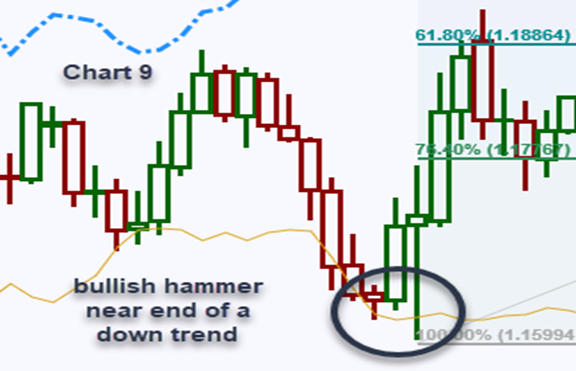
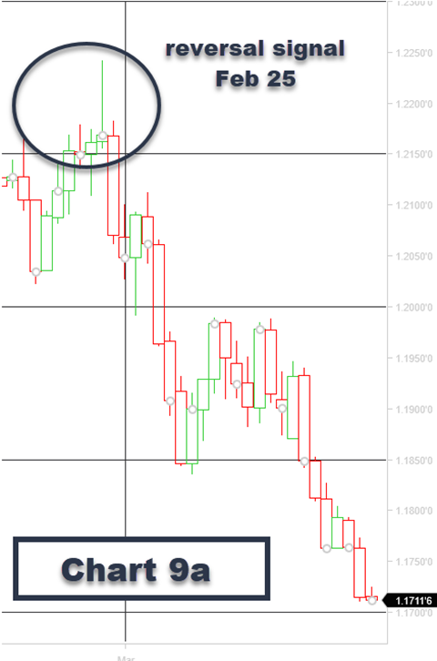
The bearish hammer on Chart 8 (EUR/USD Feb 25) was eventually corroborated once the technical buying around the Fibonacci retracements dissipated. The Feb 25 close at 1.2168 closing price was that period’s cycle high and ultimately resulted in the March 31 low of 1.1709. Chart 9A.
To recap, if a Hammer forms on a daily chart in the same direction as the trend, it is probably just indicating that the trend remains intact and to buy dips in an uptrend or sell rallies in a downtrend. However, if a Hammer appears in the opposite direction to the trend, it’s indicative that prices should be moving counter-trend for at least the next one to two sessions.
After a significant surge or decline in prices, suppose the hammer forms and is accompanied by a gap in price action in the same direction as the hammer. In that case, this could be a trend-changing hammer, and overbought/oversold indicators should be consulted.
The Doji chart pattern
The most common Dojis look like a cross (+) and aren’t considered a reversal signal. However, the fact there have been price oscillations above and below the opening price, supply and demand canceled one another.
A Doji is therefore considered a sign of uncertainty or change. Whenever I see a Doji on a chart, it forces me to re-evaluate why I put the trade. If I am looking to put a position on but looking for a better entry price, it makes me reconsider market conditions and timing.
A Doji candlestick means that the trend has slowed down – but it does not imply an immediate reversal. This is a frequent misinterpretation leading to the incorrect use of Dojis by some traders. Despite the odds of a market turn increasing with a Doji, it still lacks a confirmation to be traded upon. In that sense, if the price on the next candlestick moves materially higher or lower on the close, it either refutes or confirms the direction of the prevailing trend (Chart 10 below).
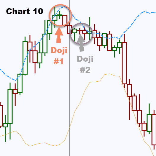
On Chart 10, you will note Doji #1 (orange) arrives after a strong uptrend and the following day’s high was significantly lower than the previous day’s high. It revealed that the market was not only unsure at those levels but also the bearish candle that followed confirmed that the Doji was a sign of change and uncertainty in this instance.
You will also note that Doji #2 (grey) arrives after a top has already been formed, is sandwiched in between a small bullish hammer and a bearish hammer. Doji #2 is a sign of indecision as bulls and bears battle for supremacy.
The following day’s higher top fails to pierce the previous resistance area and is way above Bollinger Band overbought lines (blue dotted line). Therefore, bullish traders were discouraged by the lack of follow-through buying.
The downtrend was reinforced nine days later, but the market was clearly in two minds about future direction throughout that period, and Doji #2 provided a strong hint that bullish market sentiment was waning. All Dojis are not created equal. However, some are more powerful indicators than others.
Technical analysis and the Dragonfly and Gravestone Doji
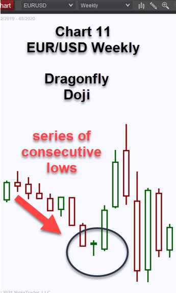
A Dragonfly Doji is a strong signal that prices will move higher; its characteristics are similar to a normal Doji, i.e., The opening and closing prices are virtually the same levels (or in very close proximity). In this instance, the market drove prices significantly lower after the open but buyers
emerged on the way down, and strong demand drove prices back to the opening levels.
This signifies that the market is looking to buy dips, and you can anticipate further demand in the subsequent few sessions. It is thus seen as a bullish signal rather than neutral. (Chart 11).
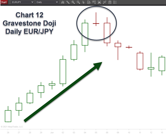
A Gravestone Doji is a strong signal that prices will move lower. Its anatomy is similar to a normal Doji, i.e., the opening and closing prices are virtually the same levels (or in very close proximity). In this instance, though, the market drove prices significantly higher after the
open, but sellers emerged on the way up, and strong supply drove prices back down to the opening levels. It usually occurs after a strong uptrend.
This is a sign that the market is looking to sell rallies, and you can anticipate further supply in the next few sessions. The Japanese analogy is that it represents those who have died in battle.
Other popular Candlestick Chart Patterns
After talking about hammer patterns and dragonfly, gravestone, and other Doji formations, let’s explore additional candlestick price patterns that traders find useful when trading.
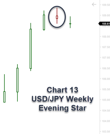
Evening Star
An Evening Star formation develops at the end of a strong uptrend. It denotes significant buying pressure that culminates in a topside gap on the daily chart that initially continues higher on the day but the move fizzles out.
Sellers emerged on the rally as the market is long the underlying instrument. Confirmation can only be determined at the close of the following day.
This formation is a strong signal to exit longs and, if so inclined, enter short – to be used as a sell signal or a “stop and reverse” signal (Chart 13).
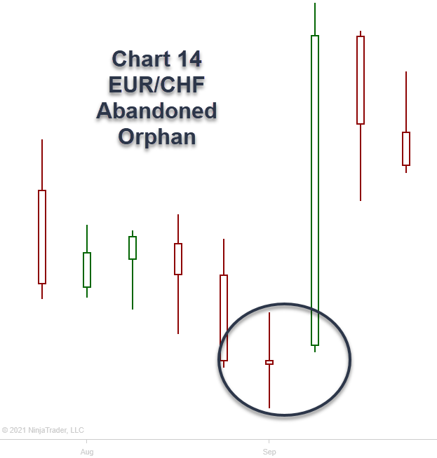
Abandoned Orphan
An abandoned orphan formation develops toward the end of a strong down- or upward-trend when selling or buying pressure subsides, culminating in a failure to penetrate the most recent significant low or high. This exhaustion of the trend is followed by a gap, a so-called “window” in Japanese candlestick parlance.
This is a strong reversal signal, denoting the market was predominantly short or long the underlying instrument, but it now risks to be reversed. Once again, it can be used as a strong exit signal and, if so inclined, go short or long the new trend with a type of “stop and reverse” signal (Chart 14).
Candlesticks show more than just prices
Some traders question whether candlestick charts really work; however, that can be said of all charts; it’s how the charts are interpreted and what other tools are used to draw conclusions that determine trading strategies.
Candlestick charts are more straightforward to read than many other charts, and the many unique individual candle formations do bolster confidence when used in conjunction with other technical tools.
Candlestick charts are not just for Futures traders; they’re used globally to analyze all traded products. The Nikkei is one of the most heavily traded indexes globally, so US equity traders who may be reluctant to embrace the discipline may surprise themselves at what the candlestick charts reveal.
Keen to know more? Take this Candlestick cheat sheet with you always!
References for this article
- Understanding Basic Candlestick Charts by Investopedia
- How to Read a Candlestick Chart by Daily FX
- How To Read Candlestick Charts by Warrior Trading
