


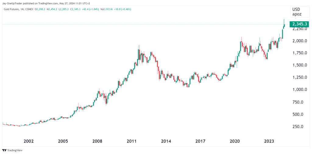
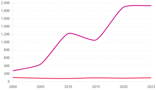
1. Gold Price Over Time
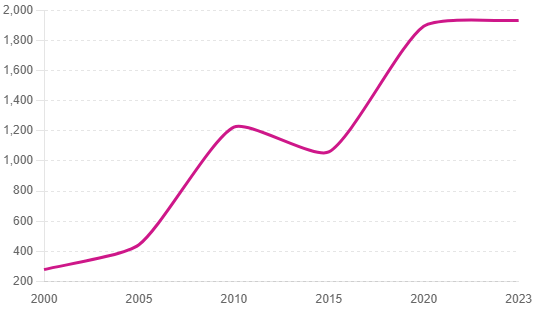
This chart shows the historical trend of gold prices from 2000 to 2023. Over this period, the price of gold has seen a significant rally, with a notable rise around 2010, peaking at over $1,800 per ounce in 2011. This increase was driven by economic uncertainty and financial crises. After a dip in mid-2010s, gold prices surged again, reaching new highs around 2020-2021 due to the economic impact of the COVID-19 pandemic, showcasing gold’s role as a safe-haven asset during times of crisis.
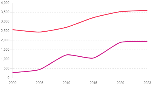
2. Gold Price vs. Inflation Rate
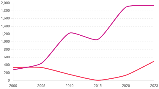
This chart compares the price of gold with the inflation rate, scaled for better visualization. Historically, gold is considered a hedge against inflation. The chart shows that periods of higher inflation rates often coincide with increases in gold prices. For instance, during the early 2000s and post-2008 financial crisis, as inflation concerns grew, gold prices rose significantly. The recent spike in inflation in 2021-2022 due to supply chain disruptions and monetary policies also correlates with a rise in gold prices. This is because with higher inflation, the Dollar becomes weaker, and since gold is priced in Dollars, the ‘value’ of gold rises. Inflation also causes more capital to flow into gold as investors seek havens.
3. Gold Price vs. S&P 500
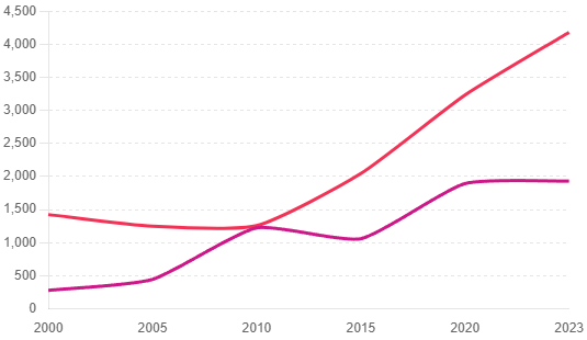
This chart compares gold prices with the S&P 500 index, highlighting the differing investment profiles of gold and equities. Generally, when the stock market underperforms, gold prices tend to rise as investors seek stability. The sharp rise in gold prices in the late 2000s and early 2020s contrasts with fluctuating S&P 500 performance, indicating periods when investors moved towards gold as a safer investment. The surge in equities occurred around 2008 when the financial crises crippled global markets. This led the Fed to engage in quantitative easing, rapidly increasing the monetary supply in the system. This ‘helicopter money flew into equities and fueled the massive bull market we are still enjoying today.
4. Gold Price vs. US Dollar Index
This chart illustrates the inverse relationship between gold prices and the US Dollar Index. When the dollar strengthens, gold prices typically decline, and vice versa. This is because gold is priced in dollars, and a stronger dollar makes gold more expensive in other currencies, reducing demand. The chart shows periods of dollar weakness, such as post-2008 and during the COVID-19 pandemic, corresponding with rises in gold prices, reinforcing this inverse correlation.
5. Gold Production vs. Gold Price
This chart correlates gold production with its price over time. While production has steadily increased from 2000 to 2023, gold prices have shown more volatility. Increased production doesn’t necessarily drive prices down, as gold prices are influenced more by economic factors, investor demand, and market sentiment rather than just supply. For example, despite rising production in the 2010s, gold prices surged due to increased demand and economic uncertainties.
Conclusion
Gold’s performance over the past two decades underscores its status as a reliable store of value, particularly during economic downturns and periods of high inflation. Now that gold has broken above its all-time highs for the first time in three years where do you see it going from here?