


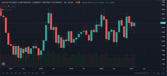
Line charts, candlestick charts, patterns and trends are some of the concepts you may have heard if you are interested in trading.
By the end of this article, you will understand what a trading chart is, how to read it and how to apply technical analysis; what types of charts exist; what a trend is, and some of the most common patterns.
What is a chart?
A traditional trading chart is a graphical representation of price data series. Advance charting also includes other information like volume and technical indicators. Other market-related data, represented on charts, are tools that will help you improve your trading strategy; but first, you must understand the basis of a price chart. You can find all these charts on any trading platform or charting software that offers real-time data.

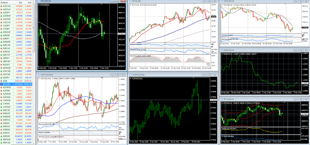
First of all, you must choose the asset or index you wish to analyze. If you are trading in Forex, this can be a currency pair like EUR/USD; if you trade stocks, Apple shares (AAPL). The price will be reflected in the “Y” or vertical axis of the chart (see previous figure), and the time evolution is represented in the “X” or horizontal axis
Secondly, you must determine the time frame. You can choose intervals of less than one minute (1M) to one hour (1H) to four hours (4H); or you can also use daily (D), weekly (W), monthly (M) or yearly intervals. The time frame will change the time intervals on the horizontal axis.
If you want to do day trading, you most likely will use shorter time-frames, probably making trading decisions based on the price action in one-hour charts, and then deciding to trigger the order by looking at five-minutes charts.
Finally, you should apply the technical analysis tools you consider appropriate and complement your analysis with indicators, such as moving averages, Fibonacci retracements, Bollinger bands. Most indicators can be used in any time-frame. The concepts are the same; you will probably need to adapt some parameters when you move from a long-term time frame to a shorter one, but the information the indicator transpires remains the same.
Types of charts
Choosing the type of chart that best suits your trading strategy is not an easy task, particularly because there is a great variety. However, there are 3 main types you should know:
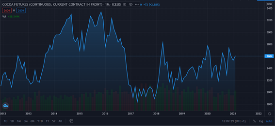
- Line chart: this is the starting point for beginner traders. This chart is created by lining up the closing prices of the chosen asset in the defined timeframe, for instance, all the 1-hour close prices. It does not allow you to visualize the opening prices or the variations between high and low prices in each interval. However, it is useful to visualize trends quickly and without the “noise” of the intraday fluctuations.
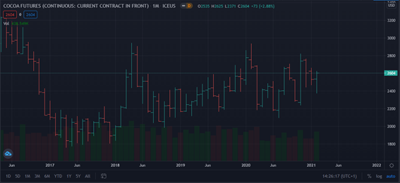
- Bar chart: Unlike the previous chart, it includes information on the high, low, open and close prices in the chosen timeframe. Each period is represented by a vertical bar where the length of each bar shows the highest and lowest price reached by that asset in the period considered. They are joined by two short horizontal lines that indicate the opening and closing price. In some displays, if the opening price is lower than the closing price, the line will be green; otherwise, it will be red, indicating a loss in the asset’s value. In some chart platforms, the opening price is not displayed.
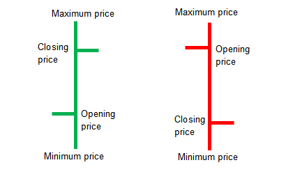
- Candlestick chart: it is the most widespread and used price chart variant. It provides the same information as a bar chart, although it presents it in a different way. Each candlestick is composed of a so-called “candlestick body”, and two vertical “candle wicks”; the former is used to represent the price range between the opening and closing prices, the wicks show the range of variation between the high and low price of the asset during that particular period.
As in the bar chart, if the candlestick is green (or white), it indicates that the opening price is lower than the closing price; otherwise, it is red (or black). The former is usually referred to as bullish candlesticks and the latter as bearish candlesticks.
How to read trading charts
Reading a trading chart is not a difficult task when you can identify what you are analyzing (be it the price of a currency pair or the behaviour of an index), what type of chart you are using and what timeframe is defined.
Platforms such as TradingView, Ninjatrader, among others, allow you to visualize these charts in real-time. However, by themselves, they provide you with limited information. This is when other concepts such as technical analysis, patterns or trends become relevant.
What is a trend and when it changes?
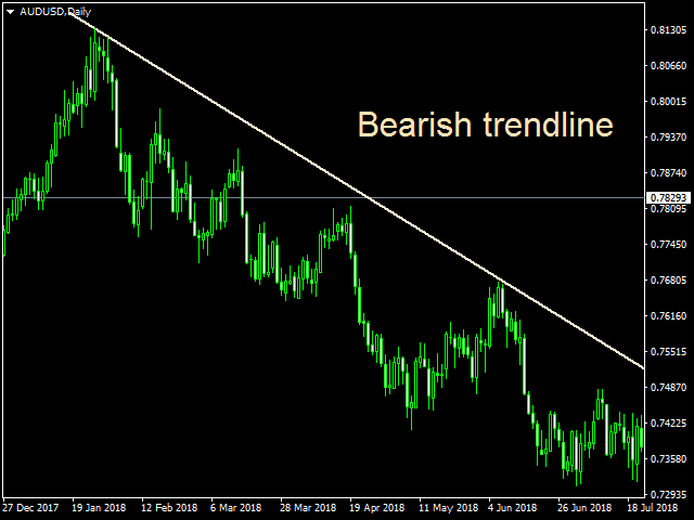
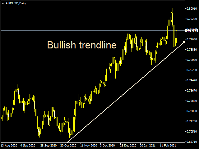
In collective intelligence, the concept of “trend” is already installed. You can use it to refer to a trend, to a hashtag that is a trending topic in social media; or in this case, to indicate the direction in which a market or asset is moving (rising or falling), in a sustained manner during a given interval. Trends can be defined by a trendline.
As a rule of thumb, a trendline connects at least 2 points on the chart. But you can also spot a trend using moving averages. When the price is above, for example, the 200-day moving average the trend is considered to be “bullish” (in an uptrend) while if it is below it is considered “bearish” (in a downtrend).
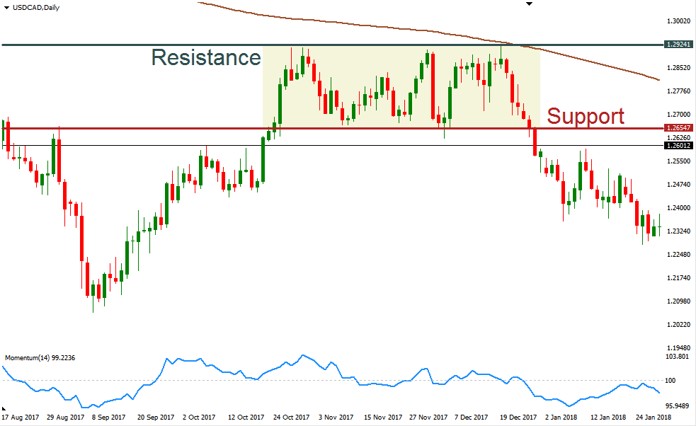
There are 3 types of trend: bullish, bearish and sideways. A bullish trend is detected when the price of the asset prints higher highs and higher lows, so the slope of the line is ascending, while in the second one, the opposite happens. The sideways or horizontal trend occurs when the price fluctuates between two price zones called support (lower band) and resistance (upper band). Support and resistance are price levels or zones that contain price action.
When a basketball player dribbles the ball on the floor continuously, with his hand; the support is the floor and the resistance is the hand, with the ball being the price.
Generally speaking, an uptrend shows that the net demand for the asset is increasing; while the downtrend indicates that the net supply is increasing. It may happen that the price fails to make new highs, starts to consolidate or reverses sharply, falling below key levels. In that case, the trend has changed.
Trading platforms or charting software provide you with drawing tools that allow you to draw not only trends, but also patterns or include technical analysis indicators. For example, taking as a reference the sideways trend (highlighted in yellow), if you apply technical analysis, you will be able to forecast a likely scenario whether it will continue its current direction or break up or down.
When talking about trends, it is necessary to mention Dow’s Theory, which states that market prices move by determining three trends:
- Primary: it is the most important and generally lasts more than 1 year, although it may vary.
- Secondary: it is defined in the opposite direction to the Primary and generally persists between 3 weeks and 3 months. They are also called “corrections” and are more volatile than the primary trend.
- Minor: they are in the opposite direction to the previous one and last up to 3 weeks.
You can trade: with the trend, against the trend and/or in a range. That means you can look for the moment that price action is about to accelerate in the direction of the main trend; look for corrections or trade between support and resistance.
Technical analysis and chart patterns
In everyday life, we use the word “pattern” to refer to a defined design or shape. In charting, price patterns refer to shapes that provide directional signals to traders. Technical analysis, which is defined as the study of financial markets based on data, patterns and trends, is used to identify them.
Read: What Is Technical Analysis And How To Use It
There are two types of patterns in trading charts:
- Continuation: they indicate that the dominant trend will endure. They are formed by intervals of price consolidation. Some examples are:
- Directional wedges: they can be downward or upward, depending on whether they are formed in downtrends or uptrends respectively. They may result in a brief market correction to return to the primary trend.
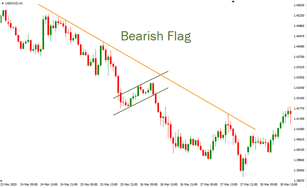
- Flags: they arise after strong movements in the trend (which will define the “flagpole” of the flag), giving rise to the consolidation of prices (they oscillate laterally until they break the “flag”, continuing the primary trend).
- Pennants: they are formed for short periods and indicate a “pause” in the movement of the primary trend. They are composed of the “flagpole” (marked trend) and a triangle (indicating such pause).
- Reversal: are patterns that occur prior to the change in the dominant trend, when a price action signals a change in direction. Some examples are:
- Head and shoulders: in an uptrend, this is defined when the price reaches three new highs, the first and third being practically equal and the second higher than the previous ones. The opposite is the case for a downtrend (in this case, it’s called an “inverted” head and shoulders.
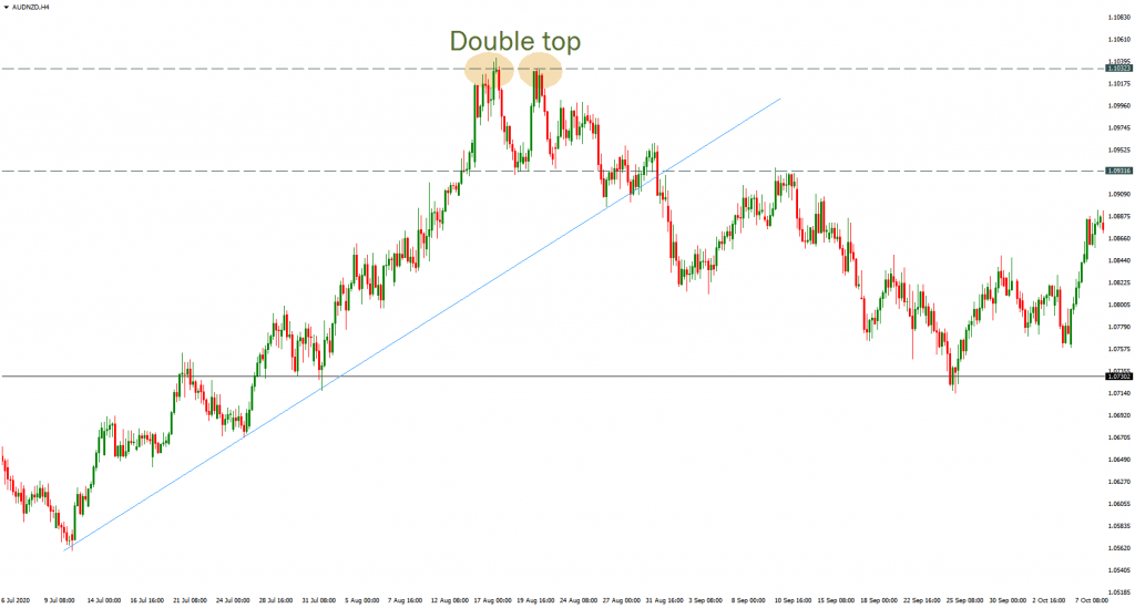
- Double top or double bottom: after a strong movement in the dominant trend, the price makes two highs (peaks) or two lows (bottom), without being able to break resulting in a change of direction in the trend.
Using real-time price charts can improve your trading
Through the application of technical analysis, you will be able to discover market trends, certain price patterns, and based on that, trade on your own, searching for targets and entry levels. As a trader, you need to know that when someone buys an asset, there is another part selling it; probably both see the market completely different, even with the same information and looking at the same chart. Doing technical analysis could lead to some consensus, although a high level of objectivity is hard to achieve.
“You can draw a trendline across the extreme prices or across the edges of congestion zones, which will change its angle as well as its message. If you are in a mood to buy, you can draw your trendline a little steeper. If you feel like shorting and squint at a chart, you will “recognize” a head-and-shoulders top. None of those patterns are objective”, wrote Dr. Alexander Elder in the recommended book “The New Trading for a Living”. As a trader, you will spend a lot of time looking at quotes, seeing price movements and inevitable wishful thinking will make you see things that are not there. It would be best if you learned to read the chart, find the best risk to reward equation between your entry and your exit leves, and trade without lying to yourself.

Reference and bibliography used for this article
- The New Trading for a Living, Dr. Alexander Elder.
- Twitter account: Steve Burns
- The First Step Guide to Technical Analysis, by Nippon Technical Analysts Association


